
Background
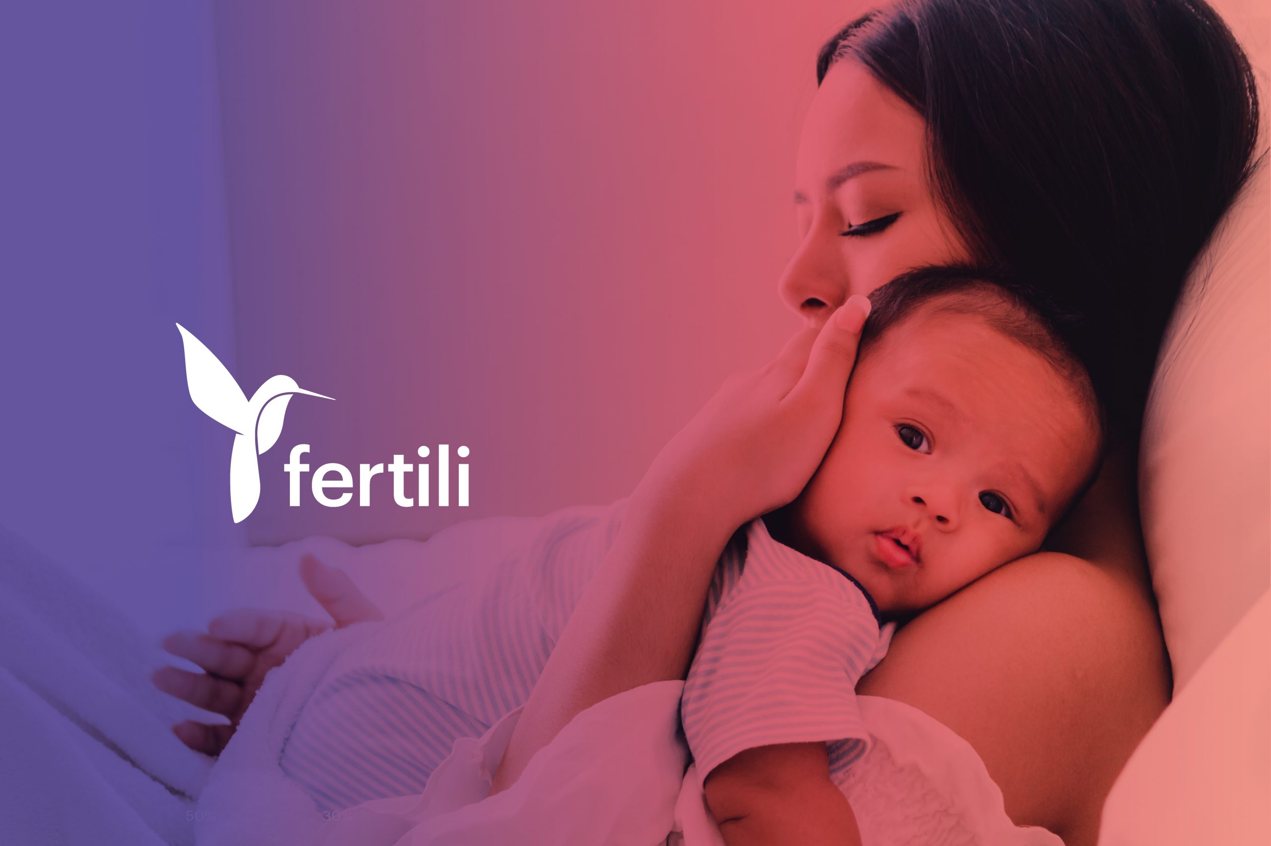
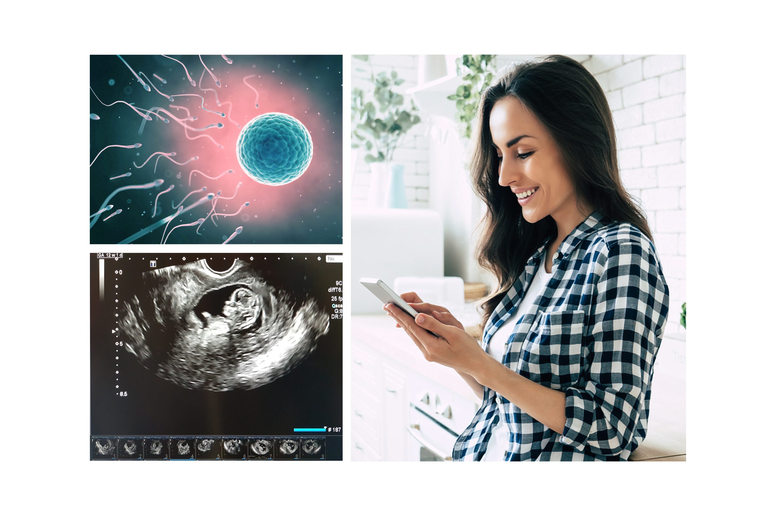
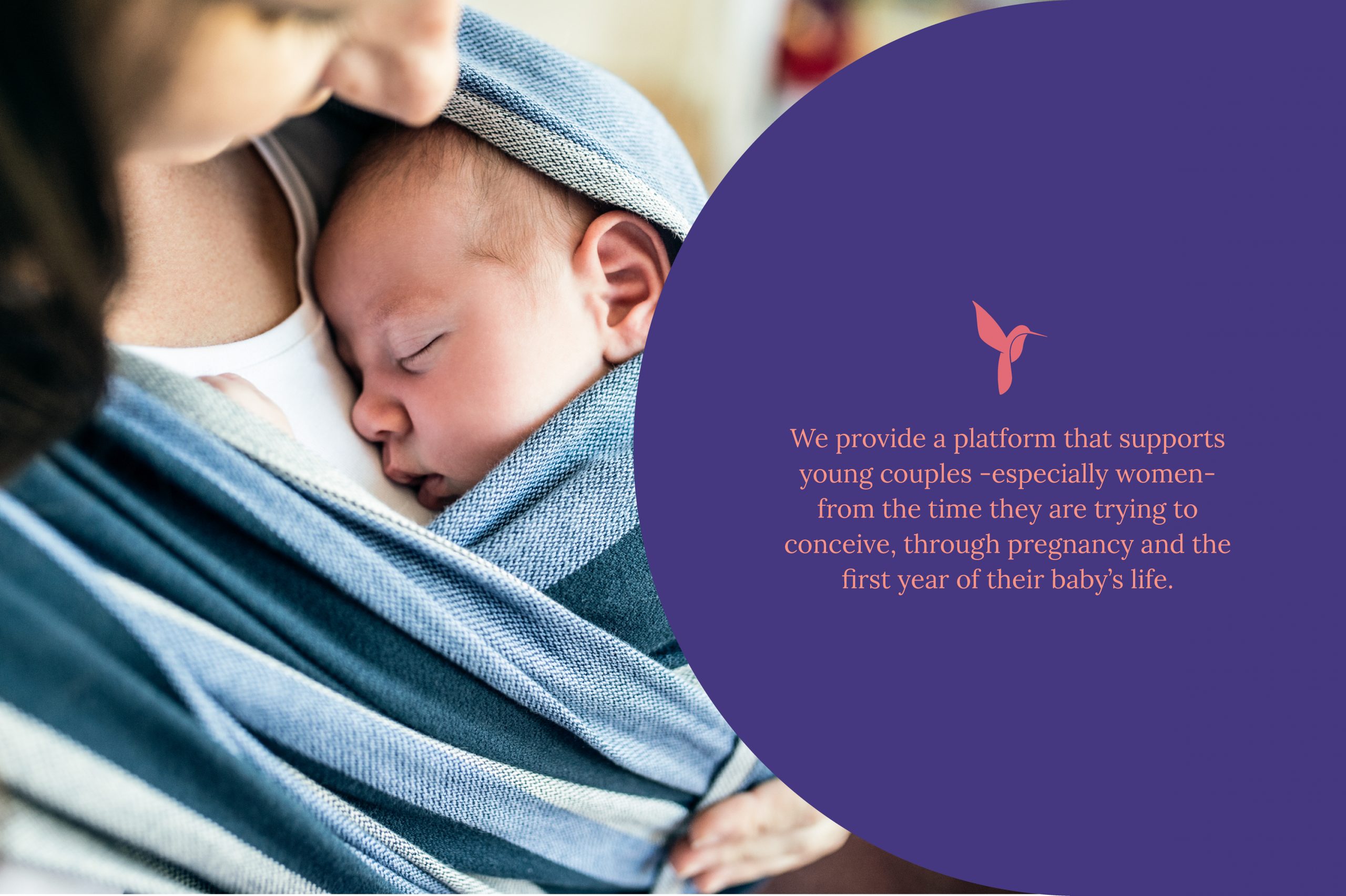
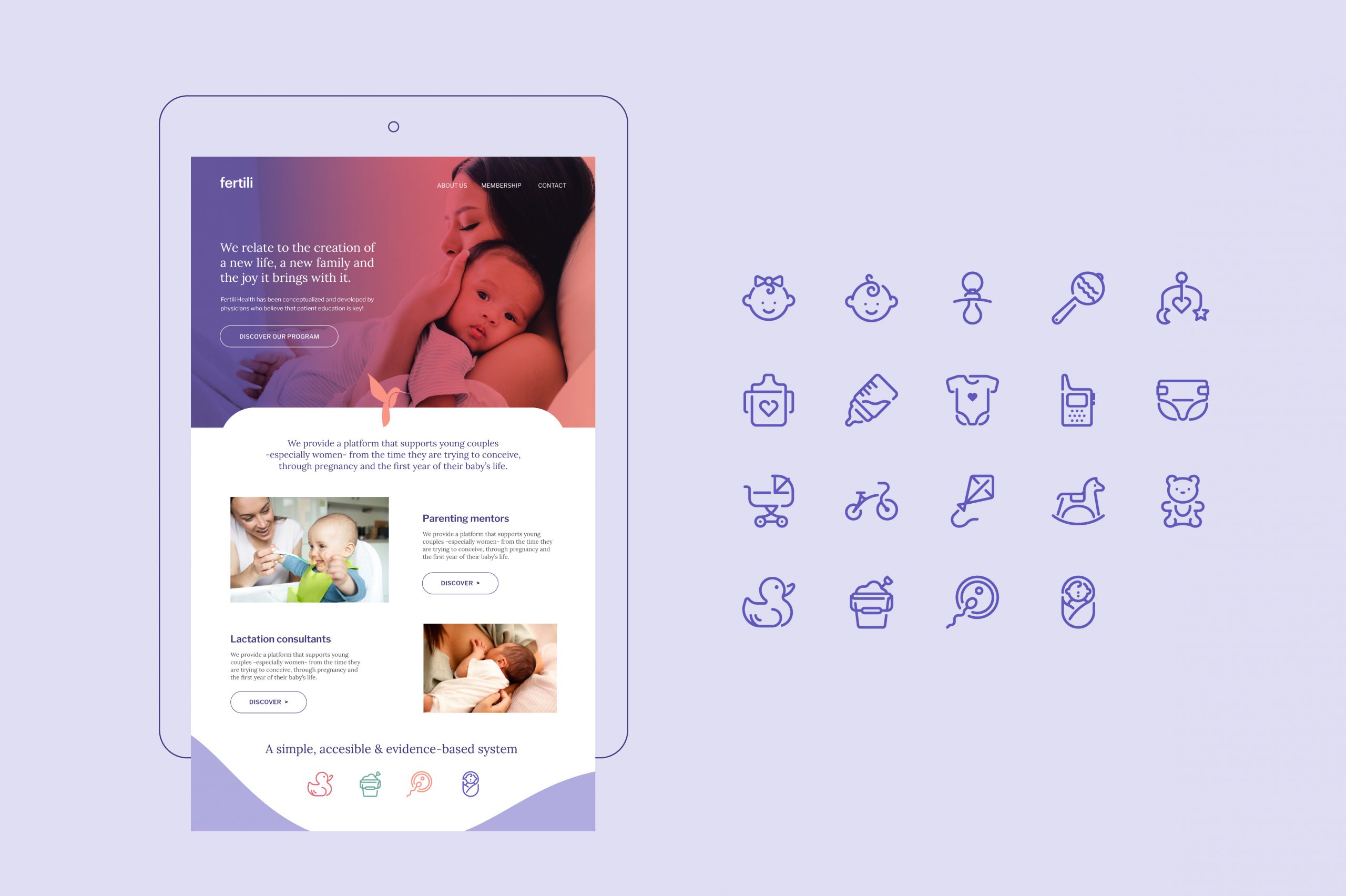
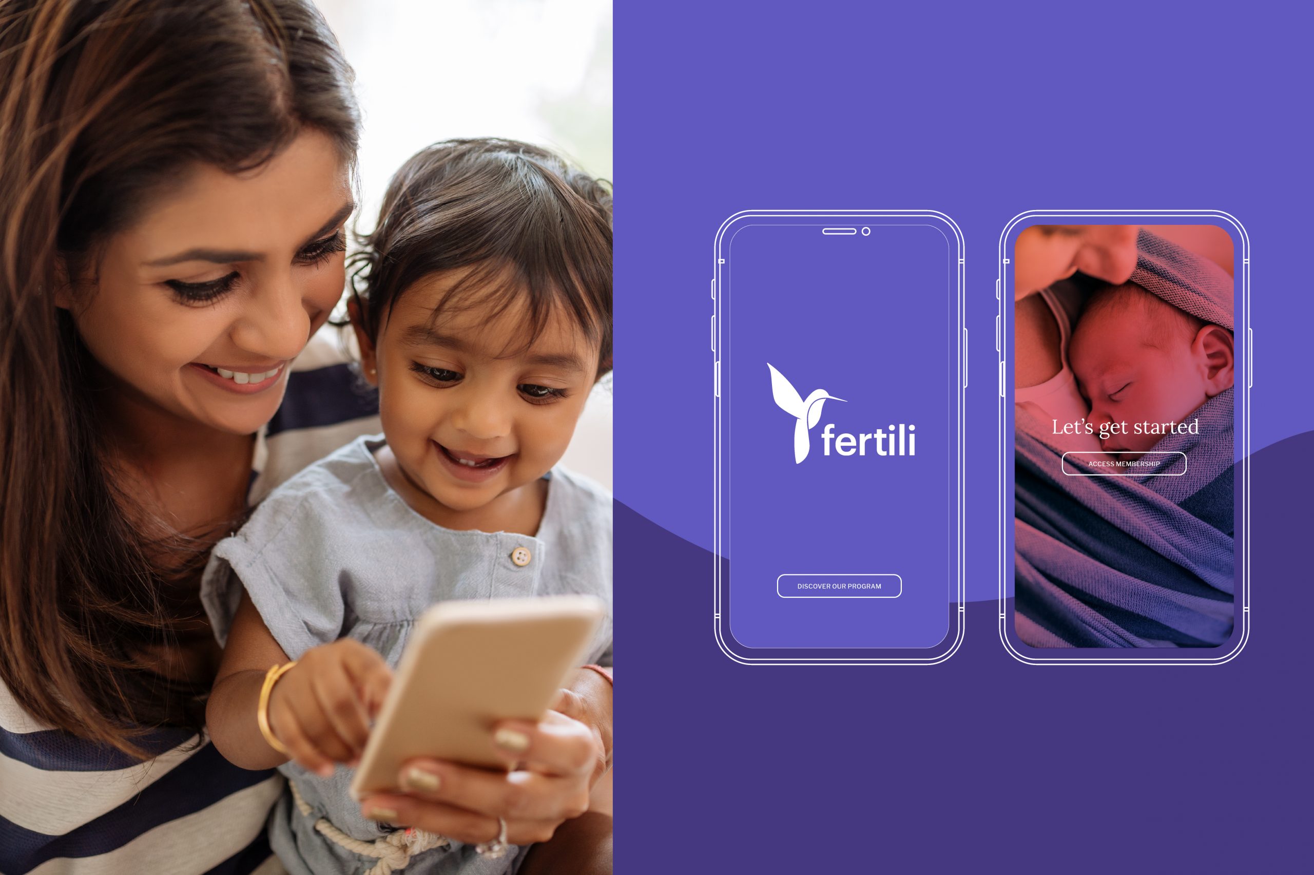
Fertili is a women’s and reproductive health company which currently focuses on patients in Mumbai, India but aim to eventually launch in the US market. It provides a platform that supports young couples -especially women- from the time they are trying to conceive, through pregnancy and the first year of their baby’s life. Fertili’s main goal is to provide scientific and evidence-based information either via the app or in the form of mentors and expert consultants available on their website. This allows new parents to feel empowered to handle the challenges thrown at them with confidence and minimal stress.
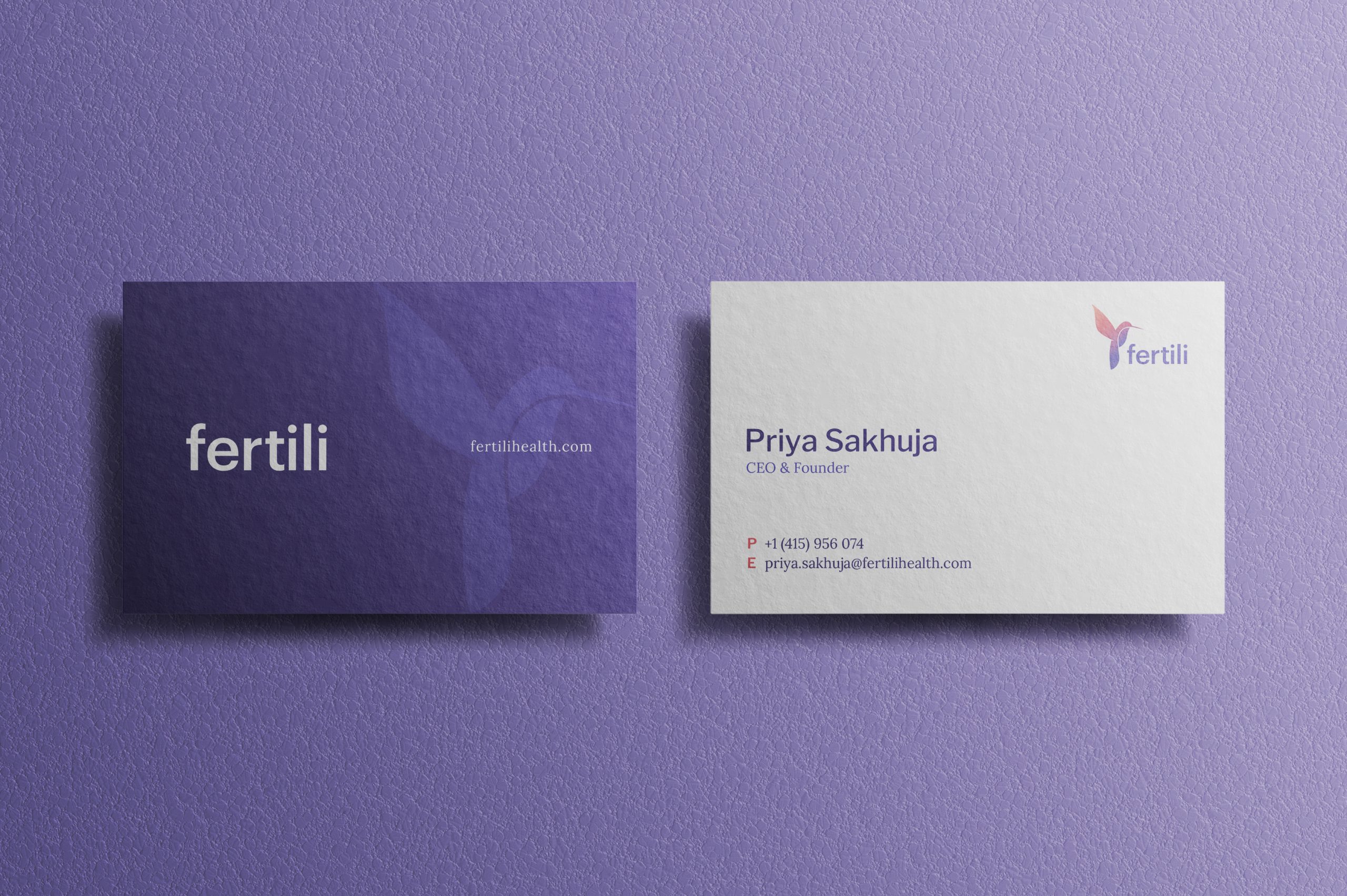
Zephyr was commissioned to develop Fertili’s brand identity. They needed a logo that made clients feel safe and supported, with a warm aesthetic but still strong and confident. The overall style had to be slightly feminine but not overwhelmingly so.
Our Work
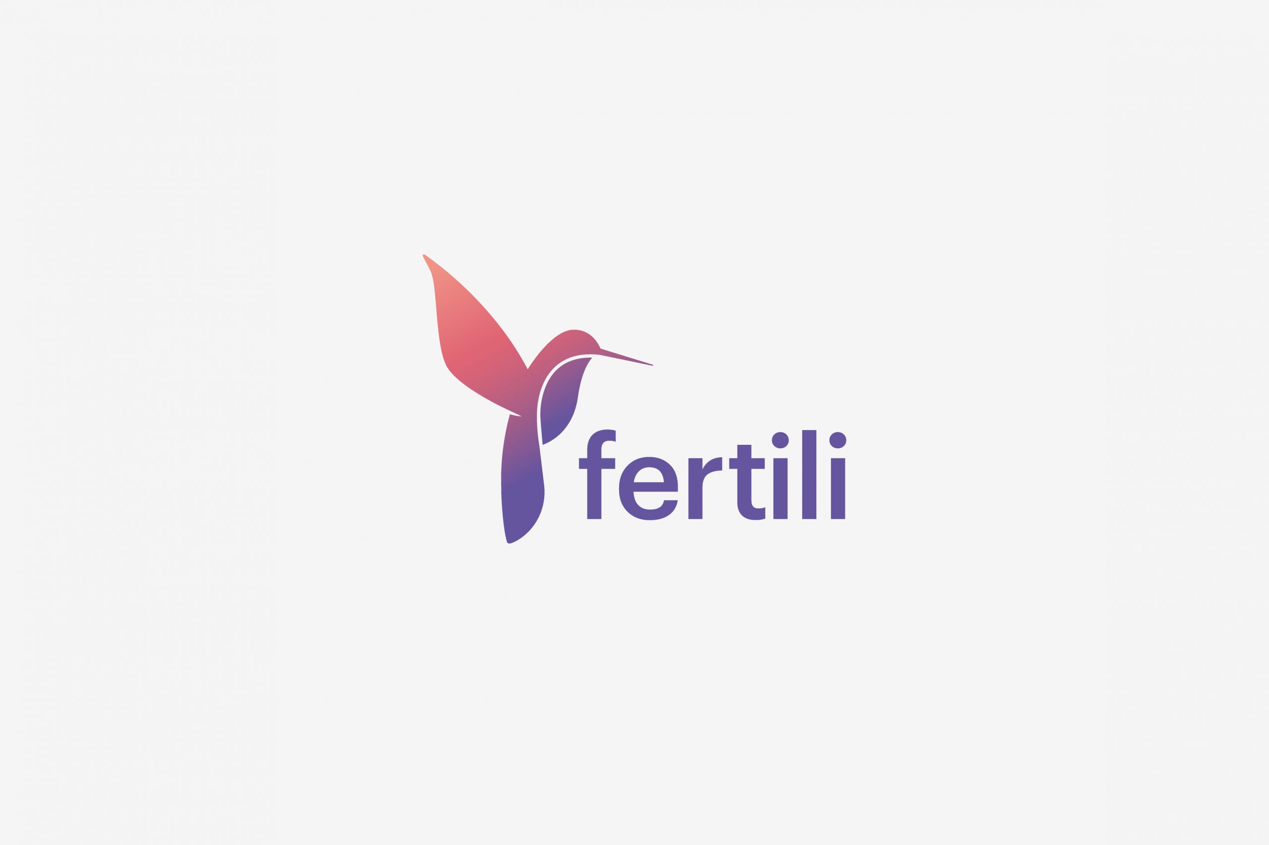
We found inspiration in nature, and focused on an animal that can serve as a powerful symbol for Fertili: the hummingbird. A hummingbird is so many things in so many ways. It is a bringer of joy, luck, hope, comfort, love, appreciation, enjoyment, independence, freedom, and optimism.
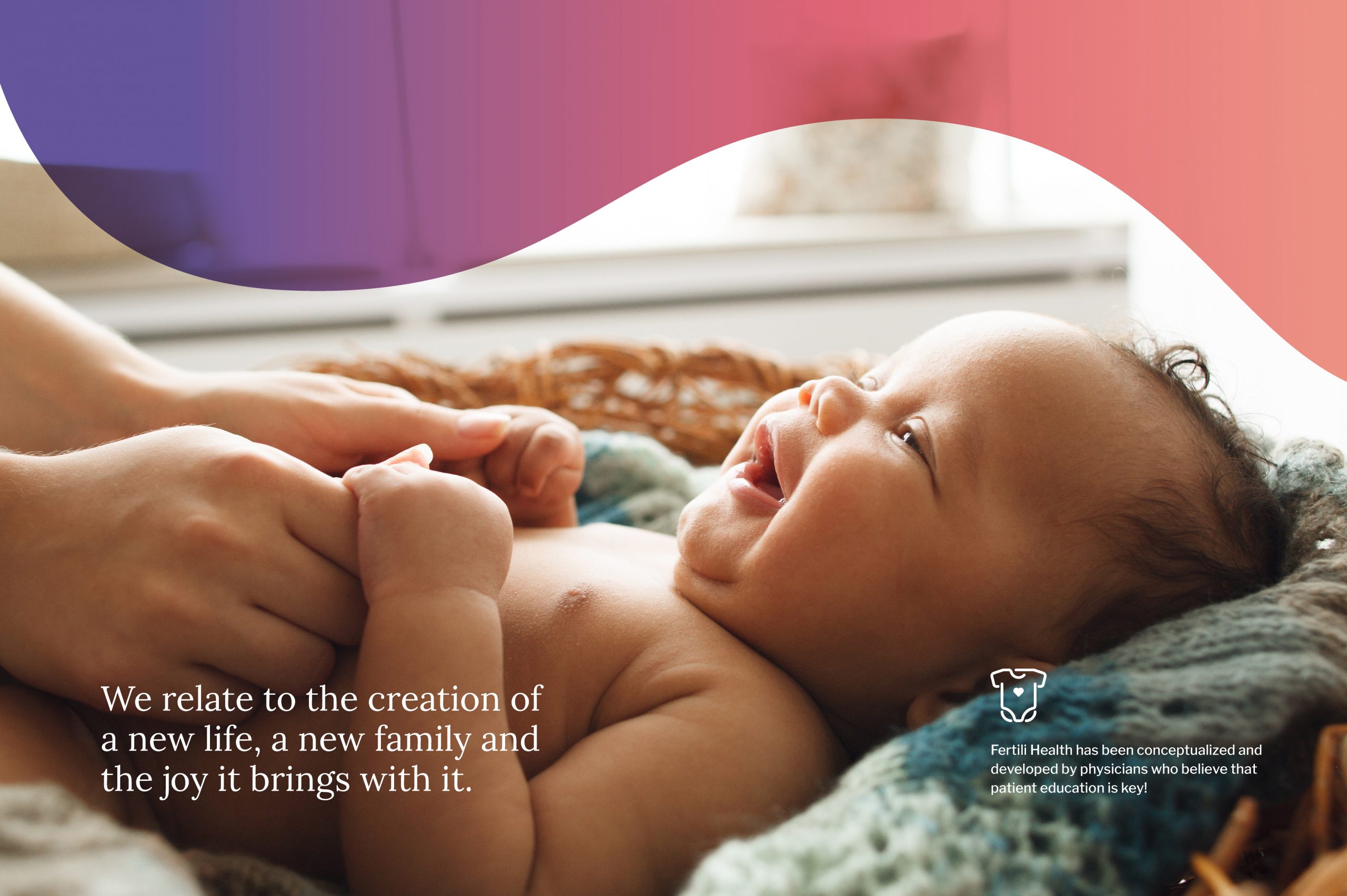
In terms of fertility, the whole act of the hummingbird to use its long bill and germinating the flowers is also interpreted in the sexual aspect. This is why native tribes around the world associate the hummingbird with life and consider it a life-giver. We used this symbolism to develop a logo that fits in with Fertili’s essence. We relate to the creation of a new life, a new family and the joy it brings with it.
With Purple as primary color and its emotional qualities towards trust, integrity and honesty, Fertili’s palette breaks down in a bold and warm set of colors that gives the brand a fresh and joyful vibe for all communication assets.
Additionally, we created a bold gradient for the visual identity, giving it a main use on the hummingbird icon. It gives life and meaning to the shape, and its brightness provides a feeling of friendliness and refreshment to the brand.